

Lead Generation|Marketing
8 best lead generation landing pages
8 best lead generation landing pages
2016-09-29
Lead Generation|Marketing
8 best lead generation landing pages
2016-09-29
Lead Generation|Marketing
8 best lead generation landing pages
2016-09-29
Table of Contents
Auto Generated TOC
Auto Generated TOC
Auto Generated TOC
Auto Generated TOC
There are a lot of components and considerations that go into making great lead generation landing pages. While adding LeadBoxer is a great start, you’ll also need to come up with tactics to make your website visitors convert from visitor to sales prospect. You will need to think about your website copy, colors, design, and more.In this post, we are going to share the 8 best lead generation landing pages. We consider these pages the best (and great compliments to LeadBoxer) because they have designs that standout, have meaningfully placed copy, and funnel people towards conversion goals effectively.Enjoy our list of best lead generation landing pages (in no specific order):
1. Salesforce.
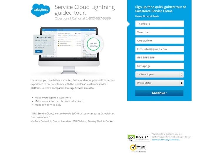
It's only natural that a leading sales company, Salesforce, would have a great landing page. This page is effective because the copy is minimal and straight to the point, security badges build trust, and the form and CTA button stand out against the background. However, the pages could also use some improvements. Making the headline more captivating and remarkable is the biggest change that can be made to this page.
2. Tableau.
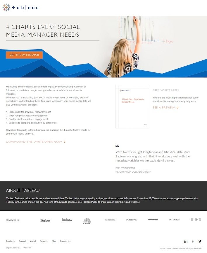
The Tableau landing page is simple, but impactful. It is good because it has multiple call to actions, has badges from popular publications it has been featured in, shows testimonials that highlight other customers, and it also gives a free preview of the white paper. However, there are two major improvements that could be made to this page. The page has a clickable logo, which could distract people from the white paper download goal. Second, the footer is full of links that bring users away from the landing page and out of the white paper download flow.
3. Microsoft Small Business Academy.
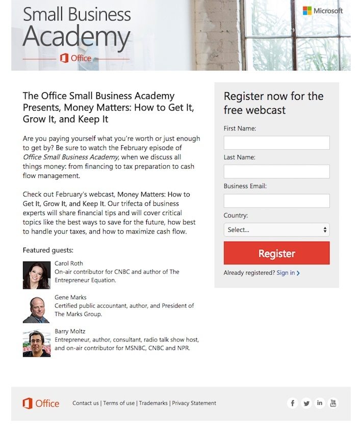
The purpose of this landing page by Microsoft Small Business Academy is to get the page visitor to register for a free webcast. The page is pretty effective, but definitely has spots where it could be improved. For the good stuff, the page does a great job having a vibrant CTA button color, the form that needs to be filled out is short, and, lastly the guest photos do a great job getting users to engage with the page more. For the bad, the CTA button text could be significantly improved. This page also makes the mistake of having the social media buttons on the landing page, which brings people away from registering for the webcast. Lastly, more effort can be used to inspire action… a window and a tree is dull; people or something more interesting would surely decrease bounce rate.
4. Traffic & Funnels.
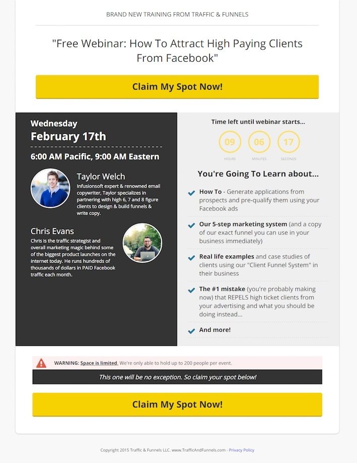
A company that helps with web traffic and funneling traffic towards goals needs to have a good landing page. It’s no surprise that Traffic & Funnels has a decent page. This page is good because it has two, massive CTA buttons (you can miss them!). The warning message on the page also helps improve clicks because it makes the website visitor feel like the offer is scarce. The headline on the page does a decent job conveying the idea of value since it emphasizes the “free.” Lastly, the short bios on the presenters are good because they assist with adding some authority to the page.
On the improvement front, this page has the wrong year on the copyright date. This is a mistake because if people read this, they’ll think that everything about this offer is out of date. Additionally, the countdown time font is awful-- it should be brighter. Finally, while this page puts good best design practices to use, it definitely could be better designed. The page doesn’t really feel all that trustworthy and kind of feels like a sleazy offer. The overall page design could use some design help to feel more professional.
5. ReachLocal.
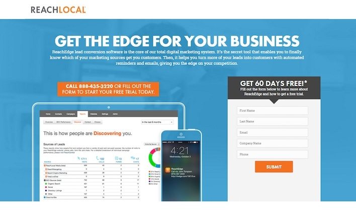
ReachLocal has a landing page featuring strong images that preview the product. The landing page all has informative copy as bullet-points (easy to read), and the video does a really good job educating potential customers.
This design of the page does have some spots where it could be improved. For example, there are two competing call-to-actions which is kind confusing. One call-to-action is asking the visitor to download an info sheet, while the other is asking you to start a free trial. The goal of the page isn’t quite clear. The submit button should also not say “Submit.” For some reason, people don’t like the word “submit.” This is likely because it is considered a friction word… people don’t want to submit to something, they want to join and be part of something.
6. Yellow Pages Marketing Solutions.
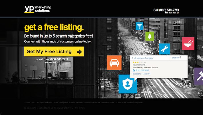
The Yellow Pages Marketing Solutions landing page is surprisingly good. The page has a fantastic call-to-action button that is focused on the value that the page view gets (“my free”). The headline also emphasizes the value of the offer, which pairs with the CTA button well. The photo on the page is relevant to the copy, which is typically something that a lot of landing pages don’t do. The phone number on the page is also clickable, which means if a visitor is on a phone they can press on the number to immediately call the company.
Even with all of the great things mentioned about, there remains room for improvement. The copyright year is incorrect on the page, which could make readers feel like other inaccuracies exist. The page could also be slightly improved to better align the CTA button to a location that would attract more attention.
7. Litmus.
The Litmus landing page is a great one to share. It's dead simple. It only has one form field and has amazingly concise copy that gets straight to the point. However, there's a problem with the form field. The field doesn't specify what to input.. it's just a blank form field.
8. WordStream.
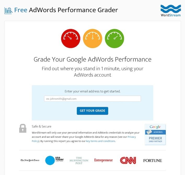
WordStream provides a unique service. They make it so that you can understand the performance of your AdWords campaigns-- quite a strong value proposition! The page is simple, with just one form field and a strong call-to-action. The headline that says "1 minute" highlights the fact that the service doesn't take much time (so you have no reason not to do it). The page also does a great job building trust. It features a "Google AdWords Premier SMB Partner" badge, shows big media companies that have featured WordStream, and there are also testimonials visible on the page.
The only major things that are potentially worth changing on this page are removing copy (because it's a VERY text heavy page). There are also too many links. It's easy for a page viewer to be brought away from the goal of an email collection.
9. The Hoth.
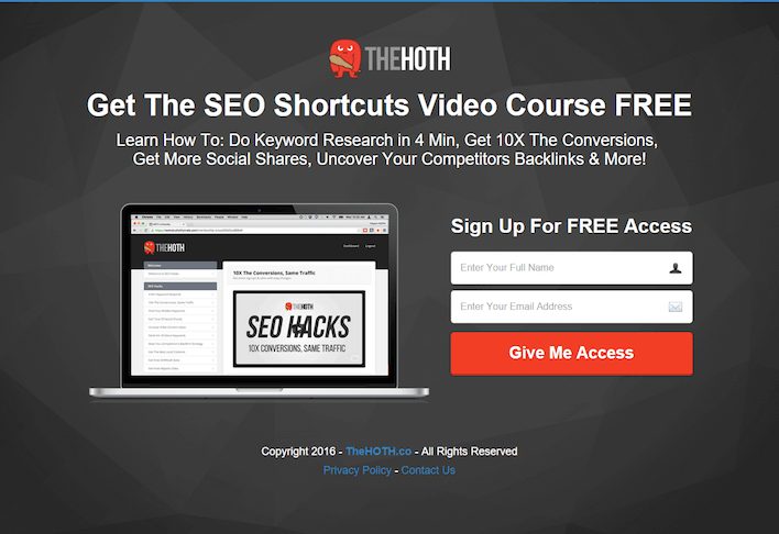
The Hoth website is clean and simple, with a very prominent call-to-action button and form. Additionally, the page mentions and highlights the notion that it's free to gain access to their product. We are only able to come up with two criticisms of this page. They could include a little more white space to make the page feel more relaxed. Additionally, the footer links send people away from the landing page. The homepage, privacy policy, and contact us links do not need to be so prominent.
There are a lot of components and considerations that go into making great lead generation landing pages. While adding LeadBoxer is a great start, you’ll also need to come up with tactics to make your website visitors convert from visitor to sales prospect. You will need to think about your website copy, colors, design, and more.In this post, we are going to share the 8 best lead generation landing pages. We consider these pages the best (and great compliments to LeadBoxer) because they have designs that standout, have meaningfully placed copy, and funnel people towards conversion goals effectively.Enjoy our list of best lead generation landing pages (in no specific order):
1. Salesforce.
It's only natural that a leading sales company, Salesforce, would have a great landing page. This page is effective because the copy is minimal and straight to the point, security badges build trust, and the form and CTA button stand out against the background. However, the pages could also use some improvements. Making the headline more captivating and remarkable is the biggest change that can be made to this page.
2. Tableau.
The Tableau landing page is simple, but impactful. It is good because it has multiple call to actions, has badges from popular publications it has been featured in, shows testimonials that highlight other customers, and it also gives a free preview of the white paper. However, there are two major improvements that could be made to this page. The page has a clickable logo, which could distract people from the white paper download goal. Second, the footer is full of links that bring users away from the landing page and out of the white paper download flow.
3. Microsoft Small Business Academy.
The purpose of this landing page by Microsoft Small Business Academy is to get the page visitor to register for a free webcast. The page is pretty effective, but definitely has spots where it could be improved. For the good stuff, the page does a great job having a vibrant CTA button color, the form that needs to be filled out is short, and, lastly the guest photos do a great job getting users to engage with the page more. For the bad, the CTA button text could be significantly improved. This page also makes the mistake of having the social media buttons on the landing page, which brings people away from registering for the webcast. Lastly, more effort can be used to inspire action… a window and a tree is dull; people or something more interesting would surely decrease bounce rate.
4. Traffic & Funnels.
A company that helps with web traffic and funneling traffic towards goals needs to have a good landing page. It’s no surprise that Traffic & Funnels has a decent page. This page is good because it has two, massive CTA buttons (you can miss them!). The warning message on the page also helps improve clicks because it makes the website visitor feel like the offer is scarce. The headline on the page does a decent job conveying the idea of value since it emphasizes the “free.” Lastly, the short bios on the presenters are good because they assist with adding some authority to the page.
On the improvement front, this page has the wrong year on the copyright date. This is a mistake because if people read this, they’ll think that everything about this offer is out of date. Additionally, the countdown time font is awful-- it should be brighter. Finally, while this page puts good best design practices to use, it definitely could be better designed. The page doesn’t really feel all that trustworthy and kind of feels like a sleazy offer. The overall page design could use some design help to feel more professional.
5. ReachLocal.
ReachLocal has a landing page featuring strong images that preview the product. The landing page all has informative copy as bullet-points (easy to read), and the video does a really good job educating potential customers.
This design of the page does have some spots where it could be improved. For example, there are two competing call-to-actions which is kind confusing. One call-to-action is asking the visitor to download an info sheet, while the other is asking you to start a free trial. The goal of the page isn’t quite clear. The submit button should also not say “Submit.” For some reason, people don’t like the word “submit.” This is likely because it is considered a friction word… people don’t want to submit to something, they want to join and be part of something.
6. Yellow Pages Marketing Solutions.
The Yellow Pages Marketing Solutions landing page is surprisingly good. The page has a fantastic call-to-action button that is focused on the value that the page view gets (“my free”). The headline also emphasizes the value of the offer, which pairs with the CTA button well. The photo on the page is relevant to the copy, which is typically something that a lot of landing pages don’t do. The phone number on the page is also clickable, which means if a visitor is on a phone they can press on the number to immediately call the company.
Even with all of the great things mentioned about, there remains room for improvement. The copyright year is incorrect on the page, which could make readers feel like other inaccuracies exist. The page could also be slightly improved to better align the CTA button to a location that would attract more attention.
7. Litmus.
The Litmus landing page is a great one to share. It's dead simple. It only has one form field and has amazingly concise copy that gets straight to the point. However, there's a problem with the form field. The field doesn't specify what to input.. it's just a blank form field.
8. WordStream.
WordStream provides a unique service. They make it so that you can understand the performance of your AdWords campaigns-- quite a strong value proposition! The page is simple, with just one form field and a strong call-to-action. The headline that says "1 minute" highlights the fact that the service doesn't take much time (so you have no reason not to do it). The page also does a great job building trust. It features a "Google AdWords Premier SMB Partner" badge, shows big media companies that have featured WordStream, and there are also testimonials visible on the page.
The only major things that are potentially worth changing on this page are removing copy (because it's a VERY text heavy page). There are also too many links. It's easy for a page viewer to be brought away from the goal of an email collection.
9. The Hoth.
The Hoth website is clean and simple, with a very prominent call-to-action button and form. Additionally, the page mentions and highlights the notion that it's free to gain access to their product. We are only able to come up with two criticisms of this page. They could include a little more white space to make the page feel more relaxed. Additionally, the footer links send people away from the landing page. The homepage, privacy policy, and contact us links do not need to be so prominent.
Generate More Qualified Leads with LeadBoxer
Create a (free) account or get a demo and find out how we can help you.
Generate More Qualified Leads with LeadBoxer
Create a (free) account or get a demo and find out how we can help you.
Generate More Qualified Leads with LeadBoxer
Create a (free) account or get a demo and find out how we can help you.
Generate More Qualified Leads with LeadBoxer
Create a (free) account or get a demo and find out how we can help you.
Get Started with LeadBoxer
LeadBoxer can help you quickly generate more leads
Get more insight into your online audience and their behaviour, and turn this data into actual opportunities.
Start Now!
Get Started with LeadBoxer
LeadBoxer can help you quickly generate more leads
Get more insight into your online audience and their behaviour, and turn this data into actual opportunities.
Start Now!
Get Started with LeadBoxer
LeadBoxer can help you quickly generate more leads
Get more insight into your online audience and their behaviour, and turn this data into actual opportunities.
Start Now!
Get Started with LeadBoxer
LeadBoxer can help you quickly generate more leads
Get more insight into your online audience and their behaviour, and turn this data into actual opportunities.
Start Now!
Other content in category
Lead Generation|Marketing

Harnessing the Power of Video Marketing for B2B Lead Generation

How to Develop and Implement Your First Successful SEO Campaign

B2B Lead Strategy and Marketing Alignment

Using Digital Marketing Channels for Lead Generation

How to make LinkedIn ads that actually work

Supercharge your marketing results with LeadBoxer!
Analyze campaigns and traffic, segement by industry, drilldown on company size and filter by location. See your Top pages, top accounts, and many other metrics.
Supercharge your marketing results with LeadBoxer!
Analyze campaigns and traffic, segement by industry, drilldown on company size and filter by location. See your Top pages, top accounts, and many other metrics.
Supercharge your marketing results with LeadBoxer!
Analyze campaigns and traffic, segement by industry, drilldown on company size and filter by location. See your Top pages, top accounts, and many other metrics.
Supercharge your marketing results with LeadBoxer!
Analyze campaigns and traffic, segement by industry, drilldown on company size and filter by location. See your Top pages, top accounts, and many other metrics.
